Saturday, April 14, 2007
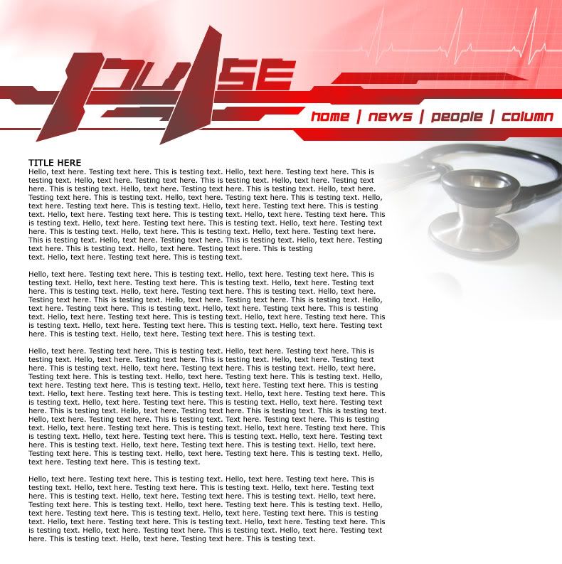
Pulse website layout draft v1.0
Okay... this is my 1st draft of the Pulse webbie layout, after about 2 hours of playing around.. (excluding taking of pictures of my stethoscope..=p) Not say very nice, but something abit different... but if Supreme Commander (Ryan) dun like, I'll have to start again..haha

On second thoughts, the ECG pattern near the top right hand corner seems abit..... off... hmmm =/
[Edit] On 3rd thoughts, the "U", "S" and "E" seem abit.....off also... shall attempt to rectify that...
posted by nwxiang at 2:34 PM |